Kin Kitchen: We’re not Drafting, We’re Designing . . . with style!
The Design Dilemma!
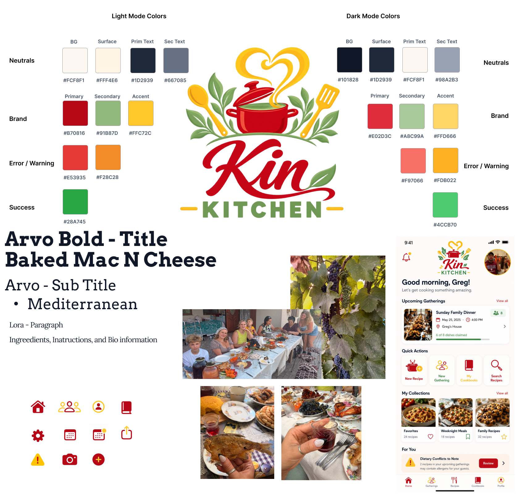
When a consumer looks at what goes into an app one thing they will look over if done correctly is the design of the UI and UX. When you’re building an app that is meant to bridge different generations of people you need to build one UI to rule them all. Some things we over look is the simplicity of colors when desining our applications. There is a theory behind it. While I chose a lot of my colors due to the feel of ripe food, the color science has also already made that correlation with the yellows and reds. I want the feel of this app to be the outdoors gathering and giant meal that familes and friends sahre after a long day of harvesting. This app needs to feel like the warmth of home and community even if you never experienced it yourself. Next is the readability of the text and the separation from titles to information. Stop looking at it as “What will grab their attention first” we all know that the right text will do that. Now is the time to ask “What commands their attention first” this is where we place into the wireframe and mock up the key elements that will build out the UI to make the UX natural.
The Thankless Job!
When I was in the Marines I had a 2nd LT as the Communications Officer. The one thing you ned to know about the Marine Corps promotion system is once you get to Sgt. you get a report that grades you on your abilities to lead. One of the topics that was on the report was the ability to train and lead the Marines in a manner that kept good order and discipline. The only area that I was marked low in. I brought it to my LTs attention that asking her if she had heard of any deficiencies in this area. When she stated she had not heard of anything I responded with, “If i am doing my job right you shouldnt hear anything about that aspect”. To which she changed my rating to a higher rating. I tell that story not to bore you but to let you know that some times your efforts go unnoticed because they fix problems before they become problems! The natrual tendency of the animals we are effectively hunting attention from love to bring up negativity. What used to be a simple way to survive by sharing the horrible state of a passage through the mountains that could kill you has now migrated into, “I had to click through three different menus just to get to my data! What a waste of time don’t download it.
So putting in the hard work now to make your app easy to use and understand will allow you to expand later incrementally when the time is right is essential to maintaining a good reputation with the community and letting your product speak for itself.
What Did we actually accomplished this week?
This week we made the Style Guide that you can see in this post. But behind the scenes much more is going on. We have our User Stories and Features spreadsheet being populated to allow us to target in on the MVP (Minimum Viable Product) stage as well as our Alpha and Beta releases. We have put a lot of work into our Design Doc that will be the road map to any other Developer that jumps on the project. This document contains the style sheet as well as back end structures. The DB structure and the file system that holds all of the assets and branding information. It also gives details about our development environment so that anybody who joined the team knows what setup to have to join in on the development. Something that will inevitably make it into the README.md file. A Broad scope of the wireframe as created and an AI assisted mock up of what that would look like with our design system was generated and put onto our style board.
Whats coming up next?
Next week we dive into the flow of the App. What will it look like to add in a recipe. How will we get to the group event we just made. How can we share our recipes! All coming up during this week.
>_ discussion
Comments
Questions, thoughts, or a better way to solve the problem? Join the discussion.